
 |
| Power BI - MD SADIUL HAQUE |
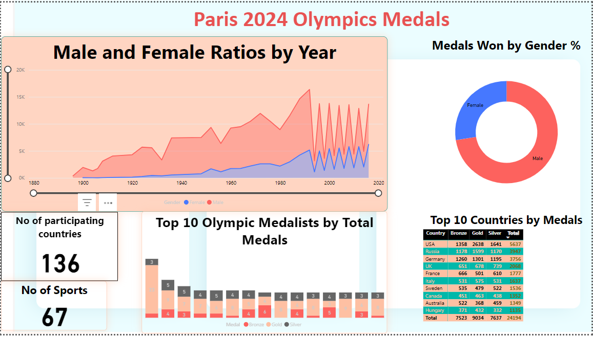
The Olympic Games are not just a celebration of athletic excellence but also a rich source of data that tells compelling stories. Using Power BI, I analyzed Olympic medal data to uncover interesting trends about gender participation, top-performing countries, and the overall evolution of the Games. Here's a breakdown of the insights:
1. Male and Female Ratios by Year: The Shift Toward Equality
The participation of men and women in the Olympics has changed dramatically over time. Using Power BI’s line graph, I visualized the historical trend of gender representation from the late 1800s to the present. The analysis clearly shows a steady rise in female athletes, especially after the 1980s, reflecting a broader movement toward gender equality in sports.
2. Medals Won by Gender %: Who’s Leading?
The percentage of medals won by men versus women reveals an interesting dynamic. By visualizing the medal data with a pie chart, I discovered that while men have historically taken home more medals, women have been closing the gap in recent years, showing progress toward balanced competition.
3. Top 10 Countries by Medals: Global Powerhouses
Which countries have dominated the Olympic Games? Using a bar chart, I ranked the top 10 nations by total medal count. Unsurprisingly, countries like the USA, Russia, and Germany lead the way, but there are also notable performances from nations like Australia and Hungary. This chart provides a clear picture of how global powerhouses have maintained their dominance over time.
4. Top Olympic Medallists: Celebrating the Best
Some athletes have left an indelible mark on Olympic history by winning numerous medals. Through a stacked bar chart, I highlighted the top Olympic medallists, showing the number of gold, silver, and bronze medals they have earned. These athletes exemplify excellence and have become legends in their respective sports.
5. Total Number of Participating Countries: A Growing Community
The Olympics have always been about bringing nations together. Over the years, the number of participating countries has grown significantly, from just a handful to over 130 nations. This increase highlights how the Games have expanded their reach, making the event a truly global celebration of sports.
6. Total Number of Sports: Expanding Horizons
The variety of sports in the Olympics has also expanded, reflecting changing interests and the inclusion of more diverse athletic events. By analyzing the number of sports across different Olympic years, I was able to show how the Games have embraced a wider range of competitions, from traditional sports to newer ones.
Conclusion: Bringing Data to Life with Power BI
This Power BI project showcases the power of data visualization to tell the stories behind the numbers. The Olympics are more than just a competition—they are a reflection of historical, social, and cultural trends. By analyzing Olympic data, we can gain a deeper understanding of the Games and the broader world of sports.
If you're looking to turn your data into meaningful insights, feel free to reach out. Together, we can create visualizations that bring your data to life!